

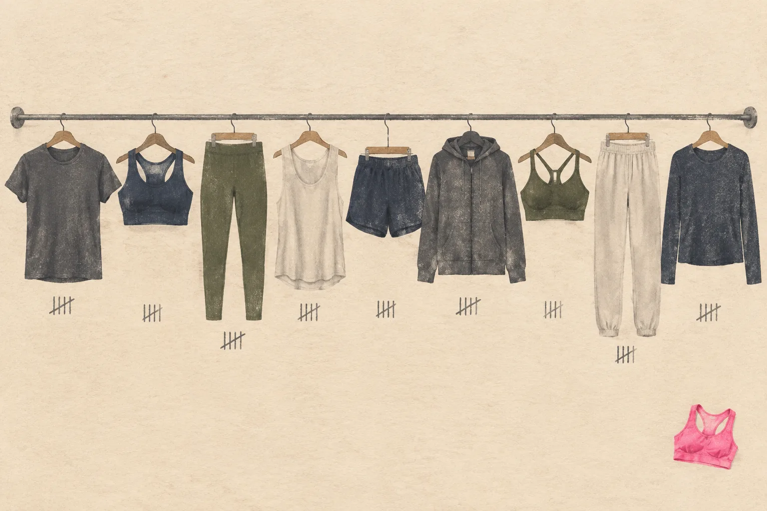
The Neutrals That Make Activewear Go Further
The gray hoodie hanging in the window of a running store looks like surrender. Next to the fluorescent yellows and the electric blues, it reads as the choice of someone who has given up on being seen. That reading is wrong. The gray hoodie is the piece that gets worn four days out of seven, long after the neon has been relegated to the back of the drawer. The neutral pieces in activewear are the ones that survive the first wash, the second season, and the morning when nothing else feels right.
This is a piece about those neutrals: the blacks, grays, navys, olives, and bone whites that make up the quiet majority of a functional athletic wardrobe. Not the statement pieces. The ones that let the statement pieces work.
Why the loud stuff gets worn once
A highlighter-pink running jacket has a specific job: it announces the wearer. That job is real, and on a dark road at 6 a.m. it is even a safety feature. But announcing is tiring. The jacket that screams demands a certain energy from the person inside it, and on a gray Tuesday in February, that energy is often not there.
The neutral layer asks nothing. It works with the rest of the closet, it works with the mood of the day, and it works with the fact that most people do not own a full matching set of anything. A black long-sleeve training top pairs with gray shorts, navy leggings, olive joggers, and the one pair of patterned tights that seemed like a good idea at the time. That is the entire case for the neutral, and it holds up.
There is a practical cost to the loud piece, too. The neon top has to be laundered more carefully to keep its color, and it shows every mark. The black top hides the deodorant streaks, the splash from the water fountain, the coffee that went sideways on the way to the car. Activewear gets dirty in ordinary ways, and the neutral absorbs that dirt without commentary.
Black is a category, not a color
Anyone who has bought black leggings from three different brands knows that black is not one thing. There is the flat, chalky black that looks like construction paper. There is the deep, slightly blue black that reads as formal. There is the shiny black that photographs well and shows every seam, and the brushed black that feels like a favorite pair of sweatpants.
The difference is usually the fabric finish and the dye process. A matte, high-coverage black hides lumps and lines. A glossy black reveals them. For most training, the matte version is the one that earns its keep, because it does not editorialize about the body underneath.
The same logic applies to gray. Heather gray, with its visible flecks, is the most forgiving neutral in activewear. It hides lint, it hides sweat marks better than mid-gray, and it photographs as texture rather than flat color. A heather gray crewneck sweatshirt over a black base layer is one of the great unremarkable outfits of the modern athletic wardrobe, and it is unremarkable in the best sense.
The navy problem
Navy deserves its own paragraph because it is the neutral that most often goes wrong. A good navy in activewear reads as deep and rich, close to black in low light. A bad navy reads as a faded school uniform, that tired mid-blue that looks like it has already been washed two hundred times.
The fix is to buy navy in fabrics that hold dye well, and to treat it like the dark color it is. Wash it cold, inside out, and keep it away from the towels. Navy fades faster than black because the dye molecules sit differently in the fiber, and a faded navy is one of the few neutrals that genuinely looks cheap.
When it works, navy is the most versatile dark neutral in the drawer. It reads slightly softer than black, which matters for anyone who finds head-to-toe black too severe for a daytime run or a yoga class. Navy leggings with a white or bone top look intentional in a way that black leggings with the same top sometimes do not.
Olive and the quiet utility look
Olive, that muted green-brown that sits somewhere between forest and khaki, has become the workhorse neutral of the last several years. It appears on joggers, on windbreakers, on the ubiquitous quilted vest. The appeal is partly visual, partly practical. Olive hides dirt and sweat impressively well, better than gray, and it pairs with black, navy, cream, and rust without argument.
There is a reason olive reads as outdoorsy without trying. It is the color of surplus gear, of canvas tents and military issue, and the association is baked in. A person wearing olive activewear looks like they might actually go outside, even if the only outside they encounter is the walk from the car to the gym door.
The caution with olive is saturation. A bright, almost lime olive looks sporty in a way that dates quickly. A muted, grayish olive, closer to the color of a faded army jacket, ages well and works across seasons. The muted version is the one worth buying in multiples.
Bone, cream, and the calculation of risk
Light neutrals in activewear are a genuine commitment. A bone-white training top shows every drop of sweat, every speck of dirt, and the faint yellowing that comes from repeated washing. This is why many people avoid them entirely, and why the ones who do buy them tend to own exactly one, worn on days when the workout is planned and controlled.
But the light neutral has a payoff that the dark ones cannot match: it makes the whole outfit look deliberate. A cream sweatshirt over black leggings is a classic for a reason. It brings light to the face, it photographs beautifully, and it signals a kind of ease that head-to-toe dark clothing rarely manages.
The practical move is to buy light neutrals in the pieces that touch the least sweat. A bone-white overshirt or a cream crewneck worn over a darker base layer gets the visual benefit without taking the full exposure. The base layer does the work; the light neutral does the styling.
How neutrals multiply a small wardrobe
Here is the arithmetic that makes neutrals worth the space they take up. A wardrobe of five neutral tops and five neutral bottoms can produce twenty-five distinct outfits. The same five tops and bottoms in five loud colors and patterns produce a much smaller number of combinations that actually look coherent, because the eye rejects most of the pairings.
This is the quiet engine of the capsule wardrobe, and it works for activewear exactly as it works for office clothing. The neutral base is the grid; the loud pieces are the points plotted on it. A single bright jacket or a patterned tight becomes wearable because it has a neutral foundation to sit against. Without that foundation, the loud piece has to carry the whole outfit, and most loud pieces cannot.
The result is that a person who buys mostly neutrals ends up wearing the loud pieces more often, not less. The neon jacket gets pulled out on the days it suits, because it has somewhere to land.
The fabric question underneath the color question
A neutral in the wrong fabric is still a mistake. Black leggings made from a thin, shiny synthetic look like cheap tights. Gray joggers in a stiff cotton blend look like pajama bottoms that escaped the house. The color cannot rescue a bad hand-feel, and the neutral makes the flaw more visible because there is no pattern or brightness to distract from it.
The neutrals worth owning tend to share a few qualities: a matte or brushed finish, enough weight to drape rather than cling, and a fiber blend that holds shape through repeated washing. Merino wool, in particular, has become the quiet favorite for neutral base layers because it regulates temperature, resists odor, and holds dye deeply. A charcoal merino long-sleeve is one of the most useful pieces a person can own, and it looks the same after fifty washes as it did after five.
Cotton-blend fleece is the other workhorse, especially in gray and navy. It is not technical, it will not wick particularly well, and it will eventually pill. It is also comfortable in a way that technical fabrics rarely are, and for the warm-up, the cool-down, and the walk to the coffee shop, that comfort matters more than the wicking.
The drawer that actually gets used
Open the activewear drawer of someone who has been training for years and the pattern is consistent. The loud pieces are folded at the back, still crisp. The neutrals are on top, slightly faded, slightly pilled, and clearly the ones that get worn. This is not a failure of ambition. It is evidence that the wardrobe has settled into what actually works.
The neutral does not ask the wearer to perform a mood. It does not require a matching set or a particular kind of day. It shows up, absorbs the sweat, hides the coffee stain, and goes back in the drawer. On the morning when the alarm goes off and the body resists, the gray hoodie is the piece that gets the person out the door. That is the whole job, and it is enough.